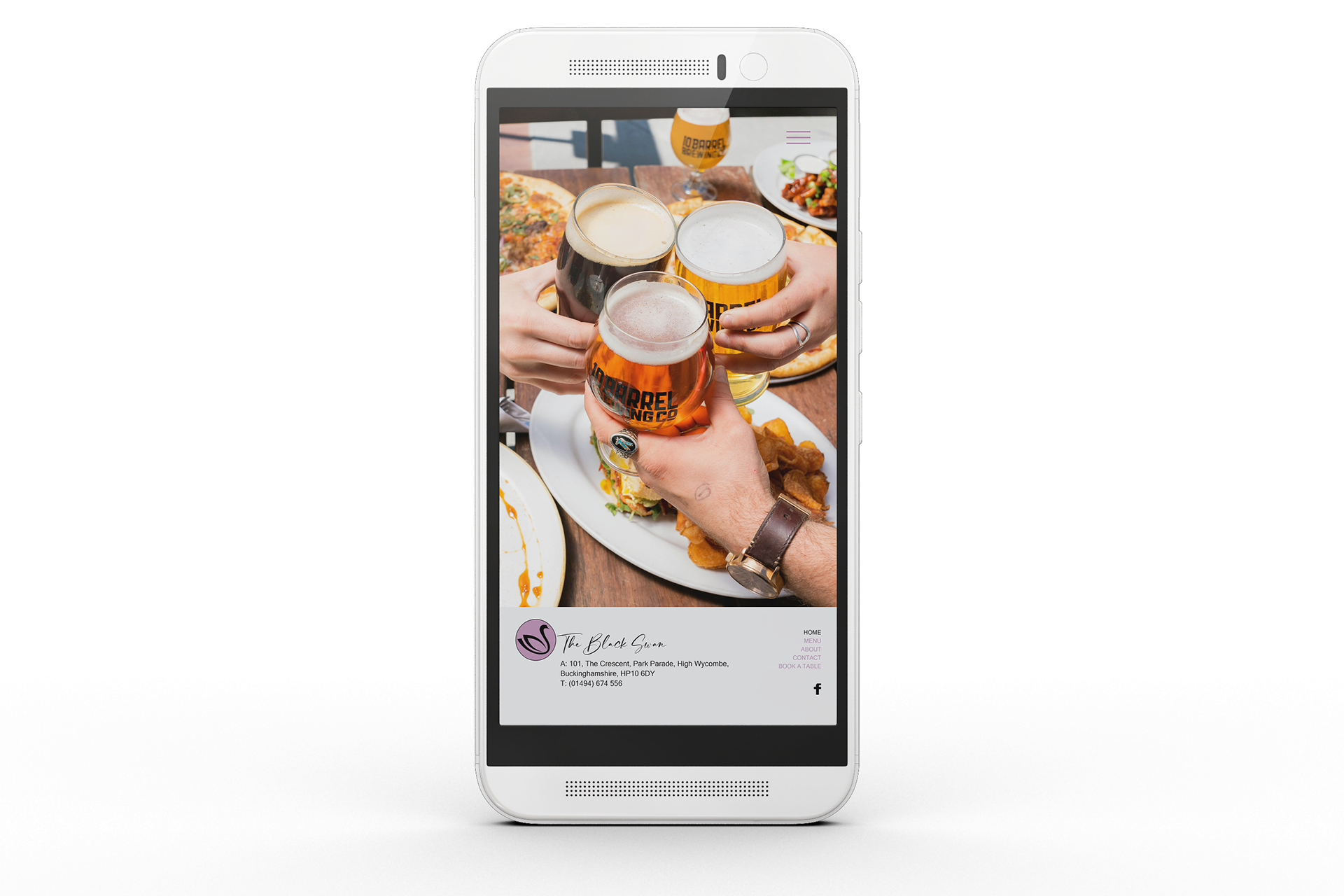
A rebrand for The Black Swan included new logo design, colour scheme and typography.
The simple 'swan' logo on muted purple background, and elegant typography communicates a rich and warm tone, whilst the grey neutral tone provides balance.
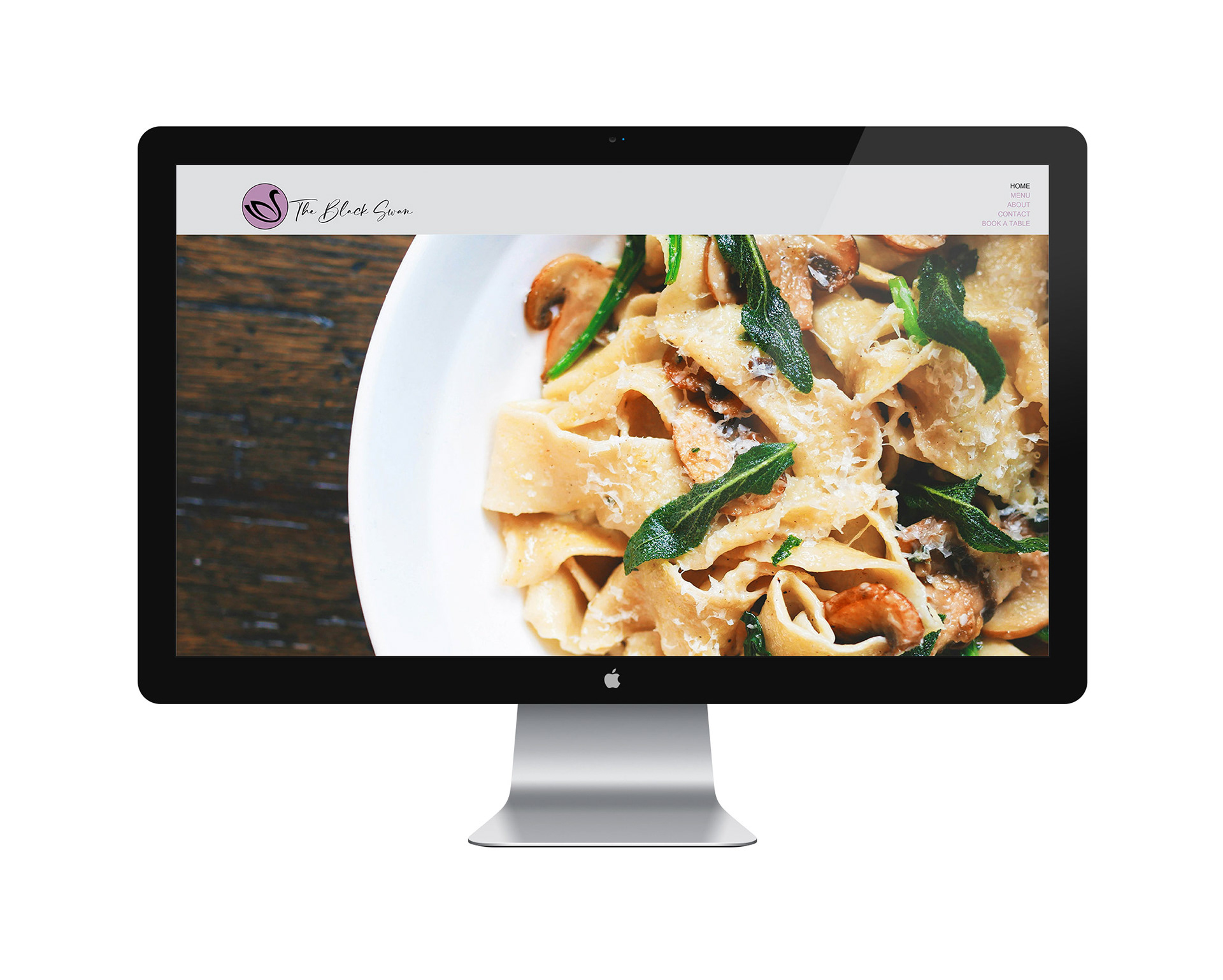
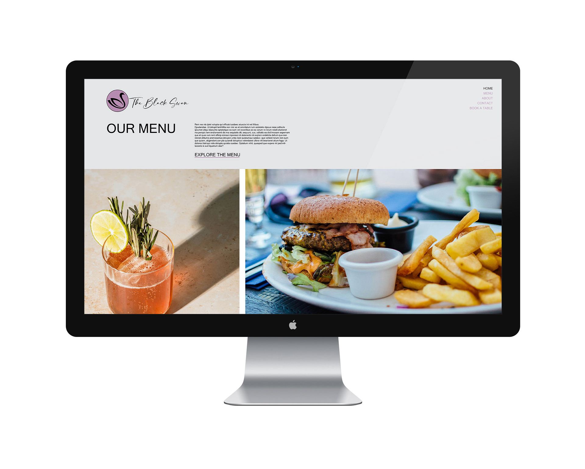
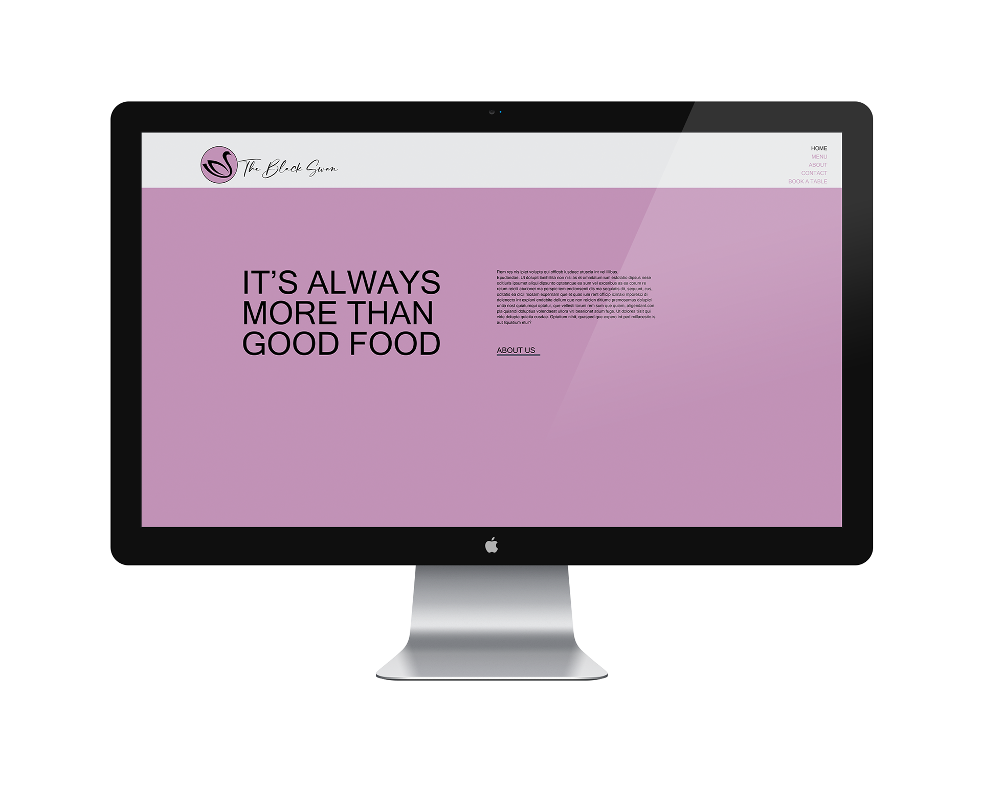
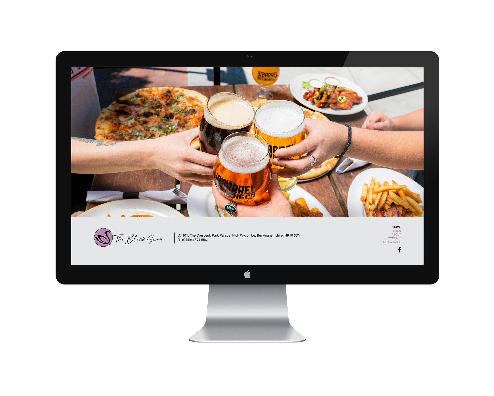
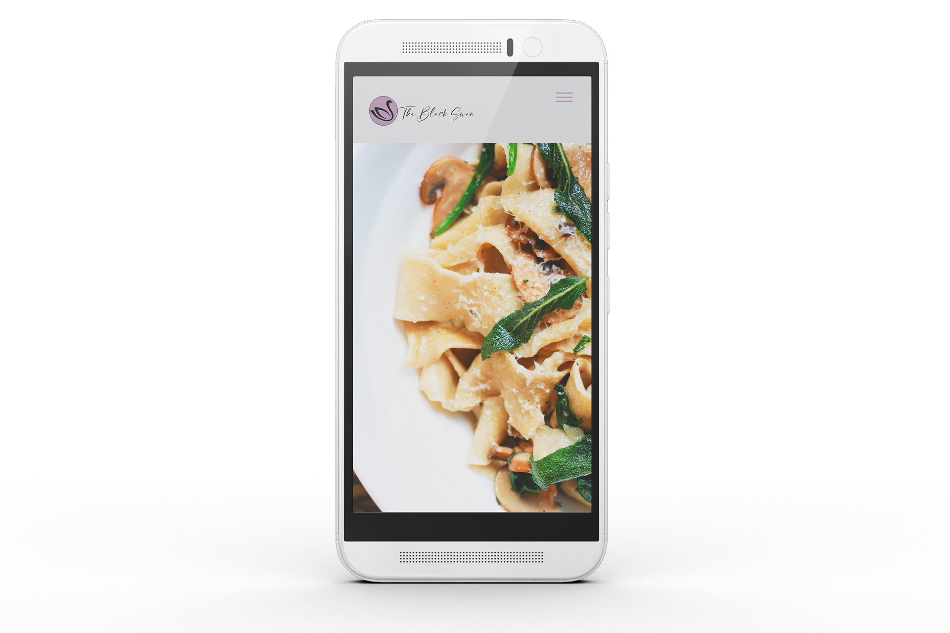
The simple grid layout of the website pages showcase the business, with consistent placing of logo and menu, making using the site easy to navigate.
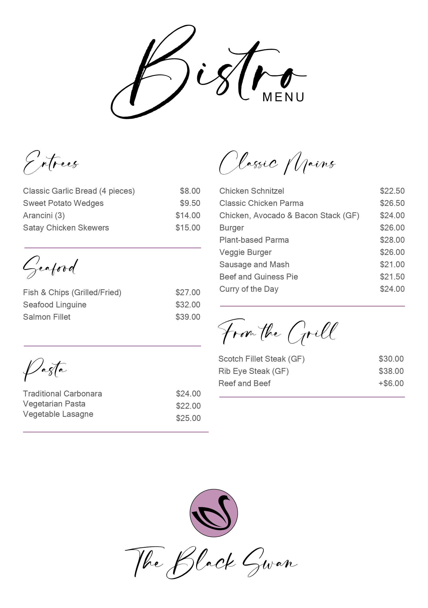
The new look menu incorporates the same colour and typography for a consistent approach.